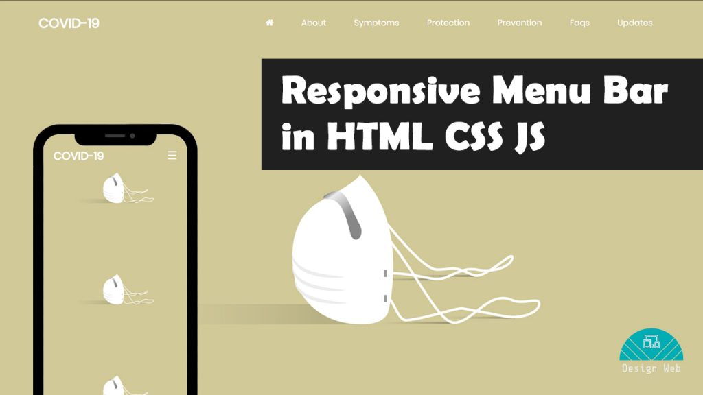
Responsive Menu Bar in HTML CSS and JS
On April 16, 2020 by Sonahang RaiMenu or the navbar are the most important part of the websites. Not only the websites but it is also very important part for any kind of application. The menu are the map for finding out the way to any website, web app and applicaitons. In this blog we will learn to create the menu. We will make the menu ui clean and also fully responsive.
We will be using the website markup language HTML and will style it with CSS. We will put life on our menu with the javascript too. So make your editor ready and lets get started.
Step 1: Lets build the HTML tags
<!DOCTYPE html>
<html lang="en">
<head>
<meta charset="UTF-8" />
<title>Skil Bar</title>
<meta name="viewport" content="width=device-width, initial-scale=1.0">
<link href="https://maxcdn.bootstrapcdn.com/font-awesome/4.7.0/css/font-awesome.min.css" rel="stylesheet">
<link rel="stylesheet" type="text/css" href="css/style.css" />
</head>
<body>
<div class="container">
<div class="nav">
<div class="logo">
<a href="#!"><h1>COVID-19</h1></a>
</div>
<div class="mainmenu">
<ul>
<li><a href="#!"><i class="fa fa-home"></i></a></li>
<li><a href="#!">About</a></li>
<li><a href="#!">Symptoms</a></li>
<li><a href="#!">Protection</a></li>
<li><a href="#!">Prevention</a></li>
<li><a href="#!">Faqs</a></li>
<li><a href="#!">Udpates</a></li>
</ul>
</div>
<div class="mobilemenu">
<span style="font-size:30px;cursor:pointer" onclick="openNav()">☰</span>
<div id="mySidenav" class="sidenav">
<a href="javascript:void(0)" class="closebtn" onclick="closeNav()">×</a>
<ul>
<li><a href="#!"><i class="fa fa-home"></i></a></li>
<li><a href="#!">About</a></li>
<li><a href="#!">Symptoms</a></li>
<li><a href="#!">Protection</a></li>
<li><a href="#!">Prevention</a></li>
<li><a href="#!">Faqs</a></li>
<li><a href="#!">Udpates</a></li>
</ul>
</div>
</div>
</div>
</div>
</body>
</html>
This is my HTML tags. Create yours in the editor. So here I have used fontawsome for the home icon. Include the cdn of fontawsome so that you can use the fontawsome. And also I have used fonts from the google fonts. I will include the fonts cdn in the css file later.
Step: 2 Now lets give css to our tags
@import url('https://fonts.googleapis.com/css2?family=Poppins&display=swap');
a{
  color: #fff;
  text-decoration: none;
}
body{
  background-image: url(https://cdn.pixabay.com/photo/2020/03/24/16/17/mask-4964590_1280.png);
  background-repeat: repeat-y;
  background-size: 100%;
  display: flex;
  height: 100vh;
  font-family: 'Poppins', sans-serif;
}
.container {
    width: 90%;
    margin: 0 auto;
}
.nav {
  display: flex;
}
.logo {
    width: 20%;
}
.logo h1 {
    font-size: 1.8rem;
}
.mainmenu{
  width: 80%;
}
.mainmenu ul {
    display: flex;
    list-style: none;
    justify-content: flex-end;
}
.mainmenu ul li{
  padding: 2rem;
}
.mainmenu ul li {
    padding: 10px 30px;
    font-size: 18px;
}
.mobilemenu{
  display: none;
}
@media screen and (max-width: 1200px){
  .mainmenu ul li {
    padding: 10px 12px;
  }
}
@media screen and (max-width: 900px){
  .mainmenu{
    display: none;
  }
  .mobilemenu {
    display: block;
    width: 50%;
    text-align: right;
  }
  .logo {
     width: 50%;
  }
}
.sidenav {
  height: 100%;
  width: 0;
  position: fixed;
  z-index: 1;
  top: 0;
  right: 0;
  background-color: #be8f4e;
  transition: 0.5s;
}
.mobilemenu span {
    color: #fff;
    line-height: 80px;
}
.sidenav ul {
    text-align: center;
    padding: 0;
    list-style: none;
}
.sidenav ul li {
    padding: 8px;
    font-size: 1.5rem;
}
a.closebtn {
    text-align: right;
    font-size: 2rem;
    margin: 20px;
}
I made the background fill with the image from the url. Also, you can notice I have linked to google fonts url at the top of css file. I have made the mobilemenu hidden in desktop devices whereas the big menu is visible in desktop view and vice versa. We will make the mobile menuu visible with the js code in next step.
Step 3: Lets make the mobile menu visible from js
As initially the mobile menu is not visible due to its width is zero. We will add the width to 100% from the js code like below.
<script>
function openNav() {
  document.getElementById("mySidenav").style.width = "100%";
}

function closeNav() {
  document.getElementById("mySidenav").style.width = "0";
}
</script>
So this is how we did it and made a responsive menu. You can get all these codes in my git here. You can also refer my youtube video for this tutorial.
Leave a Reply