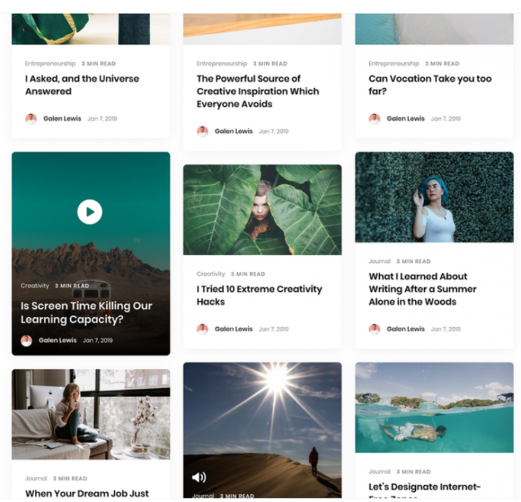
Masonry Layout by Bootstrap
On April 14, 2020 by Sonahang RaiMasonry layout is a grid layout technique. The websites consists of card or image designed to align optimally. The masonry actually standed for the brick arrangement during the construction of the house and buildings. Mainly the it is used to create an attractive gallery in the websites. Many websites also implemented their card view in the masonry layout. All card may not contain same amount of data so the size may vary. So this could make the card design to be look very odd. So the masonry was introduced in order to make the look cool and optimized. Lots of websites are using these techniques to display their galleries.

A Masonry Wall
Today we will create our masonry gallery by using the bootstrap classes. So lets get started.
Step 1:
- Lets create our HTML tags. Mine looks like these
<!DOCTYPE html>
<html>
<head>
  <title>Bootstrap Masonry</title>
  <meta name="viewport" content="width=device-width, initial-scale=1.0">
  <link rel="stylesheet" href="https://stackpath.bootstrapcdn.com/bootstrap/4.4.1/css/bootstrap.min.css" integrity="sha384-Vkoo8x4CGsO3+Hhxv8T/Q5PaXtkKtu6ug5TOeNV6gBiFeWPGFN9MuhOf23Q9Ifjh" crossorigin="anonymous">
  <link rel="stylesheet" type="text/css" href="css/style.css">
</head>
<body>

<div class="container">
  <div class="row">
    <div class="col-12">
      <div class="card-columns">
        <div class="card-container">
          <div class="card">
            <img src="https://cdn.pixabay.com/photo/2020/03/16/14/58/coronavirus-4937226_1280.jpg">
          </div>
        </div>
        <div class="card-container">
          <div class="card">
            <img src="https://cdn.pixabay.com/photo/2020/03/19/21/35/covid-4948866_1280.jpg">
          </div>
        </div>
        <div class="card-container">
          <div class="card">
            <img src="https://cdn.pixabay.com/photo/2020/03/24/16/17/mask-4964590_1280.png">
          </div>
        </div>
        <div class="card-container">
          <div class="card">
            <img src="https://cdn.pixabay.com/photo/2020/03/15/15/41/medical-4934010_960_720.jpg">
          </div>
        </div>
        <div class="card-container">
          <div class="card">
            <img src="https://cdn.pixabay.com/photo/2020/03/30/09/15/corona-4983590_1280.jpg">
          </div>
        </div>
        <div class="card-container">
          <div class="card">
            <img src="https://cdn.pixabay.com/photo/2020/03/25/11/30/envato-4966945_1280.jpg">
          </div>
        </div>
        <div class="card-container">
          <div class="card">
            <img src="https://cdn.pixabay.com/photo/2020/03/08/23/24/coronavirus-4914028_1280.jpg">
          </div>
        </div>
        <div class="card-container">
          <div class="card">
            <img src="https://cdn.pixabay.com/photo/2020/03/21/18/10/hand-disinfection-4954840_1280.jpg">
          </div>
        </div>
        <div class="card-container">
          <div class="card">
            <img src="https://cdn.pixabay.com/photo/2020/03/14/18/40/coronavirus-4931452_1280.jpg">
          </div>
        </div>
      </div>
    </div>
  </div>
</div>

</body>
<script src="https://code.jquery.com/jquery-3.4.1.slim.min.js" integrity="sha384-J6qa4849blE2+poT4WnyKhv5vZF5SrPo0iEjwBvKU7imGFAV0wwj1yYfoRSJoZ+n" crossorigin="anonymous"></script>
<script src="https://cdn.jsdelivr.net/npm/popper.js@1.16.0/dist/umd/popper.min.js" integrity="sha384-Q6E9RHvbIyZFJoft+2mJbHaEWldlvI9IOYy5n3zV9zzTtmI3UksdQRVvoxMfooAo" crossorigin="anonymous"></script>
<script src="https://stackpath.bootstrapcdn.com/bootstrap/4.4.1/js/bootstrap.min.js" integrity="sha384-wfSDF2E50Y2D1uUdj0O3uMBJnjuUD4Ih7YwaYd1iqfktj0Uod8GCExl3Og8ifwB6" crossorigin="anonymous"></script>
</html>
I have used the direct image url. We also need to include all dependency like bootstrap, jquery etc. You can refer my code.
2. Now lets add the required css
body{
	margin:0;
	background: #ecf0f3;
	padding: 3% 0;
}
.card img{
	transition: 0.3s;
	width: 100%;
    border-radius: 8px;
}
.container{
	width: 100%;
	height: 100vh;
	align-items: center;
	justify-content: center;
}
.card {
    border-radius: 12px;
    padding: 3%;
    margin-bottom: 6%;
    background: #fff;
    -webkit-box-shadow: 10px 10px 24px -12px rgba(0,0,0,0.75);
	-moz-box-shadow: 10px 10px 24px -12px rgba(0,0,0,0.75);
	box-shadow: 10px 10px 24px -12px rgba(0,0,0,0.75);
	transition: 0.3s;
}
.card:hover{
	-webkit-box-shadow: inset 10px 10px 24px -12px rgba(0,0,0,0.75);
	-moz-box-shadow: inset 10px 10px 24px -12px rgba(0,0,0,0.75);
	box-shadow: inset 10px 10px 24px -12px rgba(0,0,0,0.75);
}
.card:hover img{
	transform: scale(0.8);
}
@media screen and (max-width: 985px){
	.card-columns{
		column-count: 2;
	}
}
@media screen and (max-width: 420px){
	.card-columns{
		column-count: 1;
	}
}
This masonry is fully responsive. To make the masonry from this bootstrap we need to use the card-column class. The masonry really makes the website more appealing. You can find the code here.
Leave a Reply