Animation On Scroll
On April 29, 2020 by Sonahang RaiAnimation on scroll is one of the unique way to give your website a good look. It makes the visitor very pleased and interactive to your websites. There are lots of sites which are implementing the animation during the scroll. The different types of animations with different transition will make the website more lifely. This will make the visitor to come back to your site more often.
In this blog I will be teching you how to implement this animation on scroll in your website. I will use one of the most commonly used and famous aos library from here. We need the css and the javascript files for implementing this aos library. I will use the cdn for this time. Using the cdn will make the task faster because we need not spend time downloading the files.
The css link is -> <link rel=”stylesheet” href=”https://unpkg.com/aos@next/dist/aos.css” />
and
Javascript link is -> <script src=”https://unpkg.com/aos@next/dist/aos.js”></script>
To use this library we must firstly init the AOS.
<script> AOS.init(); </script>
If the initialization is not found then the animation will not work. After initializing we can use the aos property for animating the contents of the website. It is simple as we just need to add the property to the HTML element where we want the animation to occur. Lets see an example below
<div
    data-aos="fade-up"
    data-aos-offset="200"
    data-aos-delay="50"
    data-aos-duration="1000"
    data-aos-easing="ease-in-out"
    data-aos-mirror="true"
    data-aos-once="false"
    data-aos-anchor-placement="top-center"
  >
</div>
The above is the sample of the AOS library implementation. The data-aos is the important property as it defines which animation will occur. If other property are not set then the animation can be seen but if data-aos is not set then the animation does not occur. Let me give you full tutorial with example.
Step1: HTML
<!DOCTYPE html>
<html lang="en">
<head>
<meta charset="UTF-8" />
<title>AOS</title>
<meta name="viewport" content="width=device-width, initial-scale=1.0">
<link rel="stylesheet" href="https://unpkg.com/aos@next/dist/aos.css" />
<link rel="stylesheet" type="text/css" href="css/style.css" />
</head>
<body>
<section class="first">
<div class="container">
<div class="title flexer">
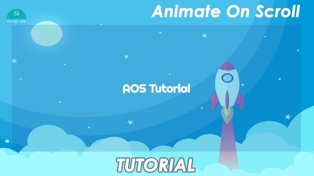
<h1 data-aos="fade-up" data-aos-duration="2000">AOS Tutorial</h1>
</div>
</div>
</section>
<section class="second">
<span class="banner" data-aos="fade-left" data-aos-duration="2000">Learn AOS</span>
</section>
<section class="third">
<div class="container">
<div class="flexer">
<div class="half simple" data-aos="fade-up-right" data-aos-duration="2000"><h2>It's</h2></div>
<div class="half filled" data-aos="fade-up-left" data-aos-duration="2000"><h2>Easy</h2></div>
</div>
</div>
</section>
<section class="fourth">
<div class="container">
<div class="card" data-aos="zoom-in" data-aos-duration="500">
<h3>ZoomIN  </h3>
<small>I am 0.5s delayed</small>
</div>
<div class="card" data-aos="zoom-in-down" data-aos-duration="800">
<h3>ZoomInDowm  </h3>
<small>I am 0.8s delayed</small>
</div>
<div class="card" data-aos="zoom-out-up" data-aos-duration="1000">
<h3>ZoomOutUp  </h3>
<small>I am 1s delayed</small>
</div>
</div>
</section>
<section class="fifth">
<div class="container">
<div class="card circle" data-aos="fade-left" data-aos-duration="2000" data-aos-easing="ease-in-sine">
<h3>FadeLeft  </h3>
<small>I use ease-in-shine</small>
</div>
<div class="card circle" data-aos="fade-up" data-aos-duration="2000" data-aos-easing="ease-in-sine">
<h3>FadeUp  </h3>
<small>I use ease-in-shine</small>
</div>
<div class="card circle" data-aos="fade-right" data-aos-duration="2000" data-aos-easing="ease-in-sine">
<h3>FadeRight  </h3>
<small>I use ease-in-shine</small>
</div>
</div>
</section>
<section>
<h1 data-aos="fade-up" data-aos-duration="2000">Try Your Now 😉</h1>
</section>
</body>
</html>
<script src="https://unpkg.com/aos@next/dist/aos.js"></script>
<script>
AOS.init();
</script>
This is my sample HTML page to implement the AOS. I have given different property for the AOS animation.
Step 2: My stylings
@import url('https://fonts.googleapis.com/css2?family=Poppins&family=Righteous&display=swap');
body{
  font-family: 'Poppins', sans-serif;
  margin: 0;
  padding: 0;
  color: #fff;
}
.container{
  width: 80%;
  margin: 0 auto;
}
.flexer{
  display: flex;
  justify-content: center;
  align-items: center;
  flex-wrap: wrap;
}
section{
  height: 100vh;
  display: flex;
  justify-content: center;
  align-items: center;
  background-repeat: no-repeat;
  background-blend-mode: overlay;
  background-color: #51b2f1c2;
  background-size: 100%;
}
section.first{
  background-image: url(https://cdn.pixabay.com/photo/2018/03/26/14/07/space-3262811_1280.jpg);
}
.title {
  font-family: 'Righteous', cursive;
  text-align: center;
  height: 70vh;
  background: #2663a938;
}
.title h1{
  font-size: 3rem;
}
.banner {
    font-size: 10rem;
    font-weight: 700;
}
section.third{
  background-image: url(https://cdn.pixabay.com/photo/2017/06/24/20/38/winter-2438791_1280.jpg);
}
.half {
    width: 50%;
    display: flex;
    justify-content: center;
    align-items: center;
    height: 50vh;
}
.filled {
    font-size: 10rem;
    color: transparent;
    background: #fff;
}
.simple {
    font-size: 10rem;
}
.filled h2 {
    color: #afafaf;
}
.fourth .container , .fifth .container{
    display: flex;
    justify-content: space-between;
}
.card {
    background: #7BC4F4;
    box-shadow: 5px 5px 10px #69a7cf, -5px -5px 10px #8de1ff;
    width: 300px;
    height: 300px;
    display: inline-flex;
    justify-content: center;
    align-items: center;
}
.circle{
    border-radius: 50%;
  }
section.fifth{
  background-image: url(https://cdn.pixabay.com/photo/2017/04/24/09/25/horse-2255876_1280.jpg);
}
These are my styles for the HTML.
You can get my full code from here. Also you can see the output and full video tutorial.
Leave a Reply