CSS Skill Bar Webdesign (Neumorphic Design)
On April 15, 2020 by Sonahang RaiA skill bar is one of the most significant part of the UI design. We can see it in lots of websites mainly are the personal website or the company websites. The skill bar is a very easy way to inform the user about some value. It is one of the significant way to tell the viewers about their skills in a percentage.
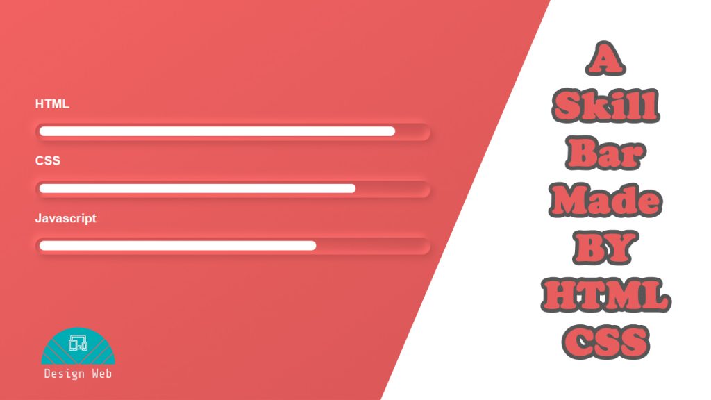
A Skill Bar
In this blog today I am going to help you make these type of skill bar. So lets get started to our tutorial and get ready with your code editor opened.
First and the foremost thing is always to include all the necessary tags for HTML. If you use VsCode then its very easy and you need not waste time writing them manually. We can easily use the code snippet and get them automatically. First lets create our html file.
<!DOCTYPE html>
<html lang="en">
  <head>
    <meta charset="UTF-8" />
    <title>Skil Bar</title>
    <link rel="stylesheet" type="text/css" href="css/style.css" />
  </head>
  <body>
    <div class="container">
      <div class="box">
        <h3 class="title">HTML</h3>
        <div class="bar" id="html"></div>
      </div>
      <div class="box">
        <h3 class="title">CSS</h3>
        <div class="bar" id="css"></div>
      </div>
      <div class="box">
        <h3 class="title">Javascript</h3>
        <div class="bar" id="js"></div>
      </div>
    </div>
  </body>
</html>
My html look like these. I have made a container div inside which I have three box for the bars. Inside the box
I made h3 for heading of the skill and then a bar div with different id name. I have given them different id so
that we can give different styling for them. We will give different width from these id so that we will have
different valued bars.
Now lets move on to our css
body {
  display: flex;
  justify-content: center;
  align-items: center;
  height: 100vh;
  background: linear-gradient(145deg, #fa6565, #d35555);
  font-family: sans-serif;
  color: #fff;
  overflow: hidden;
}
.bar {
  border-radius: 50px;
  background: linear-gradient(145deg, #fa6565, #d35555);
  box-shadow: 5px 5px 10px #c75050, -5px -5px 10px #ff6c6c,
    inset 5px 5px 10px #c75050, inset -5px -5px 10px #ff6c6c;
  width: 100%;
  height: 26px;
  position: relative;
}
.box {
  width: 600px;
  height: 68px;
}
.bar:before {
  position: absolute;
  content: "";
  left: 6px;
  top: 5px;
  background: #fff;
  height: 54%;
  border-radius: 55px;
}
#html:before {
  width: 90%;
}
#css:before {
  width: 80%;
}
#js:before {
  width: 70%;
}
You can easily understand my stylings here. I have played with the box-shadow and the linear gradient in order to achieve the neumorphic look. You can get the online generator for the neumorphism look here.
Finally we create our own skill bar. If you are confused please feel free to contact me or comment here. You can also watch my tutorial video.
I am really impressed with your writing talents as smartly as with
the structure for your weblog. Is this a paid theme or did you customize it your self?
Anyway stay up the nice quality writing, it’s rare to peer a great weblog like this one today..
This is a free theme implemented.
Hello to all, since I am actually keen of reading this weblog’s post to be
updated on a regular basis. It includes fastidious information.